
QUICK by TOKYU LAND CORPORATION
Brand Design / Production
(Client)
TOKYU LAND CORPORATION
(Description)
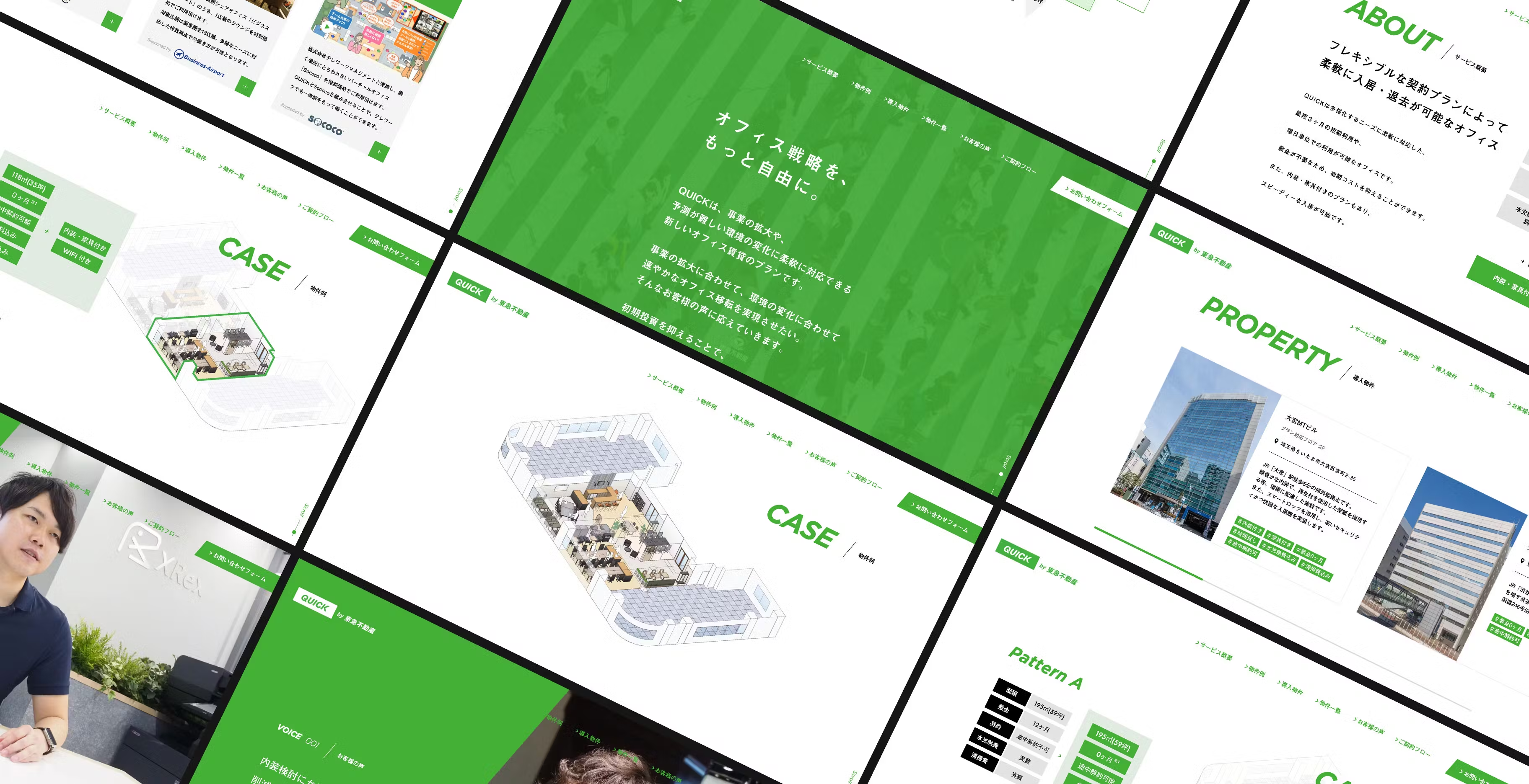
We were responsible for developing the brand strategy, brand logo, and website for "QUICK," a new office leasing plan launched by Tokyu Land Corporation, a comprehensive real estate company.
(Styling)
The new service "QUICK" is an office rental plan tailored for businesses, offering flexible options such as no security deposit, short-term leases starting from just three months, and even day-of-the-week usage plans. Some plans also include fully furnished spaces, enabling businesses to implement a fast and flexible office strategy. Leveraging the strengths of Tokyu Land Corporation as a comprehensive real estate company, we aimed to help establish and elevate this service. Our proposal combined the corporate image of Tokyu Land Corporation with the speed and flexibility embodied by "QUICK." This approach led to the creation of a brand logo that reflects the essence of the service. To convey the concept of the service simply and clearly, we integrated visuals and illustrations into the website through coding, creating an engaging yet easy-to-understand experience. The site design, centered on clarity and engagement, was a key element in supporting the launch of this new service.
(Our roll)
Copywriting
Art Direction
Web Production
Illustration


(Project team)
Art Director / Designer Kensuke Suzuki
Copywriter Tetsuya Umeda (news)
Web Director Shintaro Kawaguchi
Developer Prmo Inc.
