TEMOMIN
Brand Design
(Client)
Temomin
(Description)
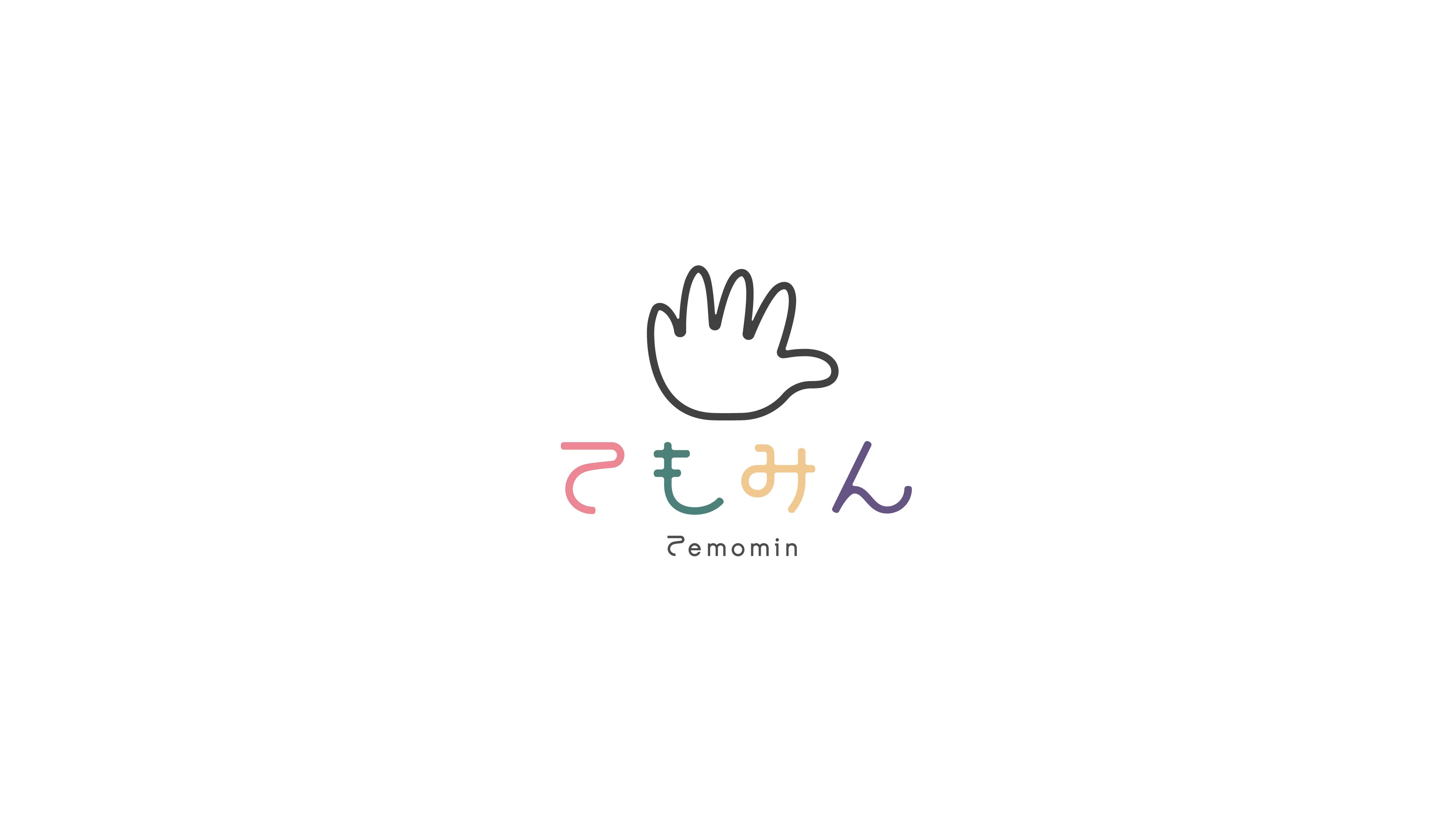
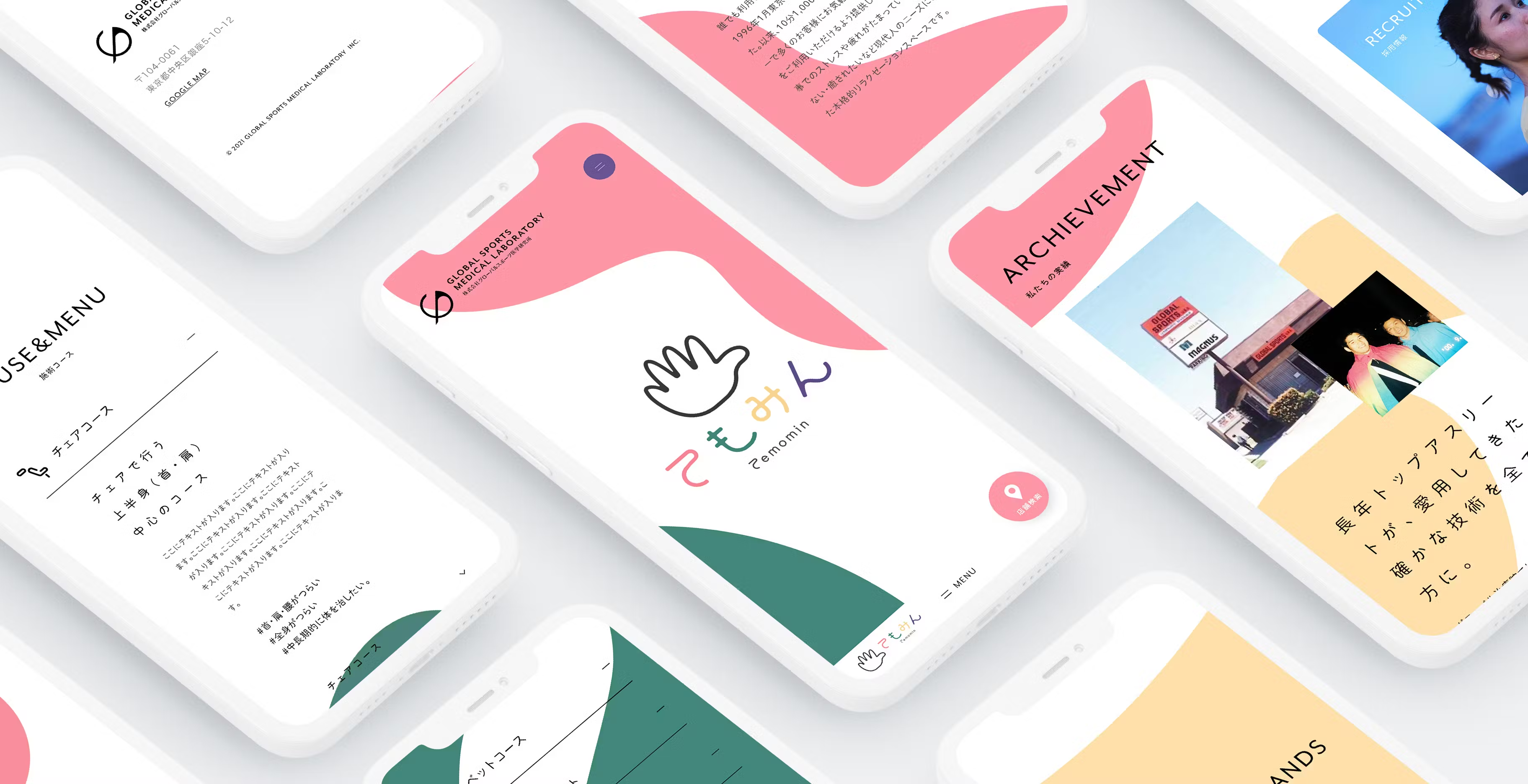
Global Sports Medical Research Institute Co., Ltd., which operates the Judo Federation of Japan-designated "Shinkyu Massage Global Treatment Clinic" and the relaxation space "Temomin," celebrated its 40th anniversary in 2022. As part of their corporate rebranding, we also refreshed the "Temomin" brand. We were responsible for developing the visual identity, including the logo redesign.
(Styling)
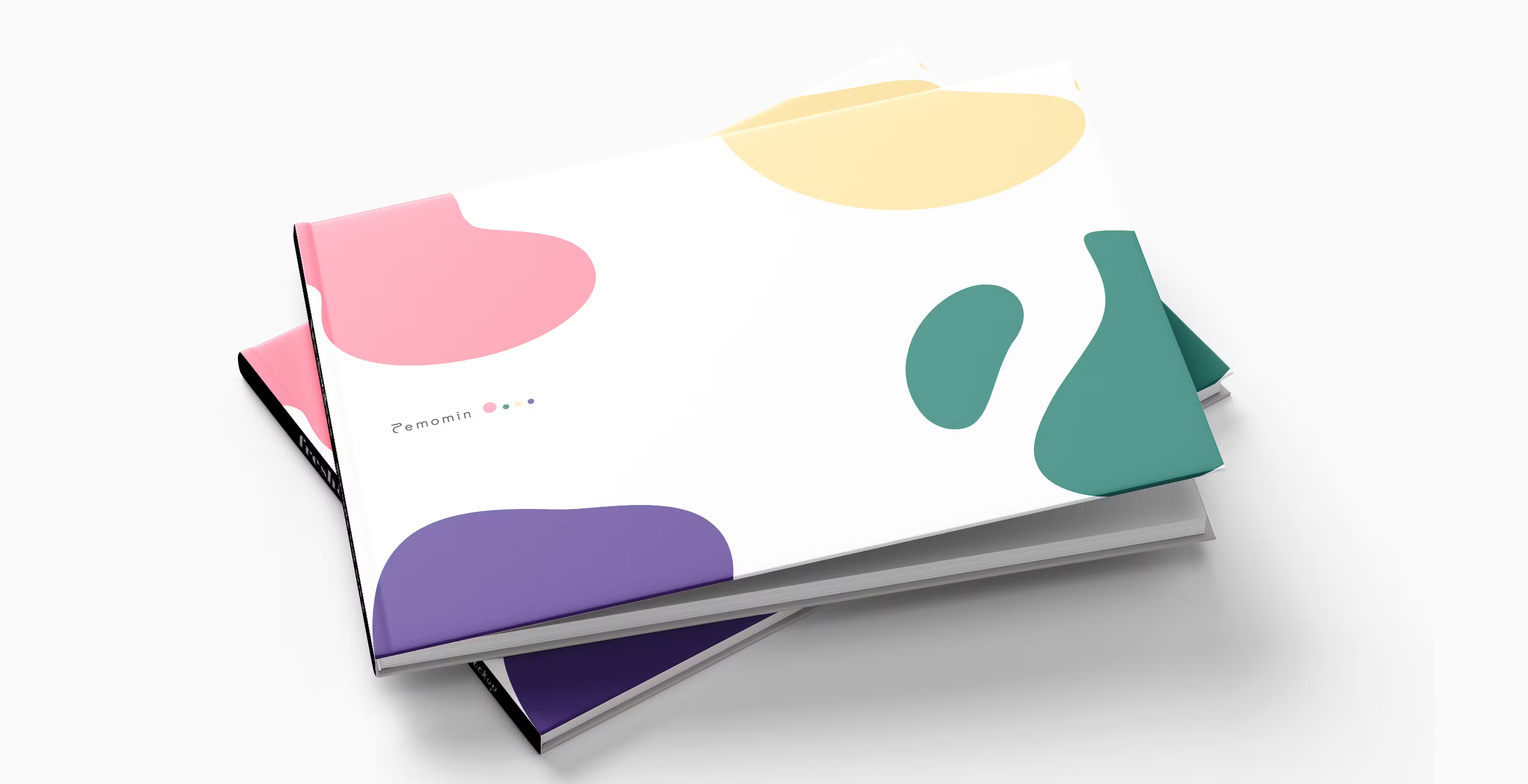
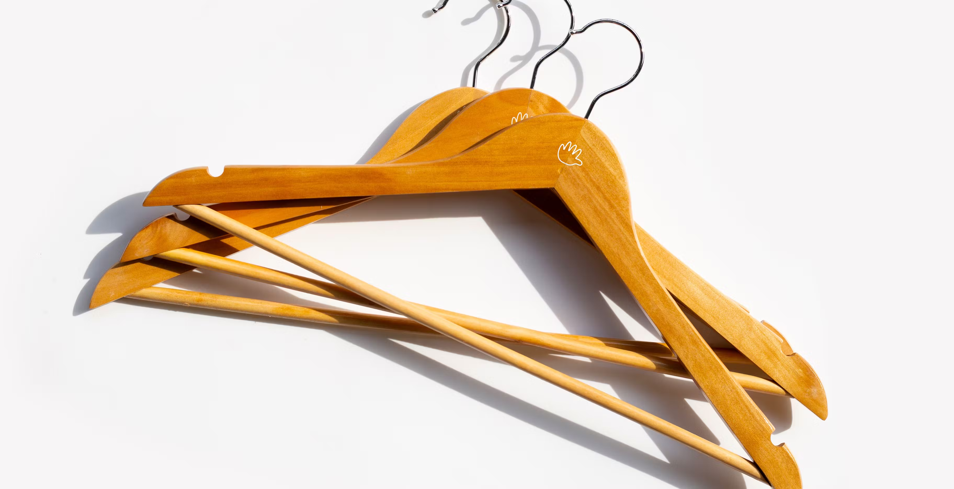
While rebranding "Temomin," the client requested that we maintain the iconic "hand" motif, which has been widely recognized and beloved for years, without altering its impression. At the same time, they wanted the new logo to be more refined than the previous one. This project was initiated based on these requests. The concept for the new logo focuses on conveying a "gentle warmth" and a "soft, relaxing atmosphere." We aimed to evoke a sense of comfort associated with relaxation by using organic, abstract graphics and a soothing color palette. There were two main changes to the original logo. First, we retained the iconic "hand" symbol of "Temomin" but refined it into a more rounded and warmer form. Second, the primary colors of the logo (red, green, yellow, and purple) were softened to gentler tones, giving the brand a more approachable and friendly impression.
(Our roll)
Brand Strategy
Art Direction






(Project team)
Producer Shota Kitayama
Art Director Kensuke Suzuki
Designer Taiki Ono
