
CANAAN
Production
(Client)
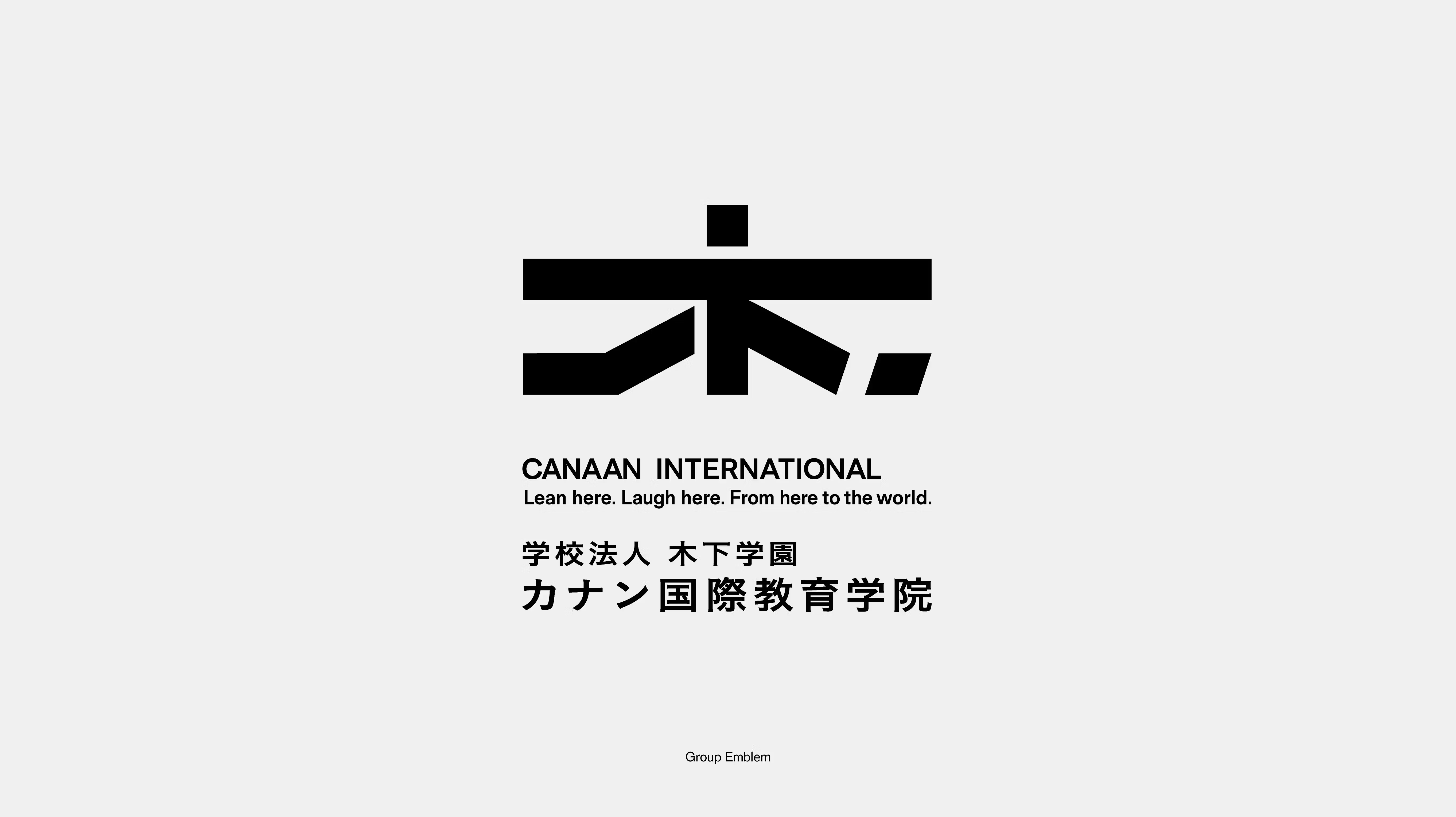
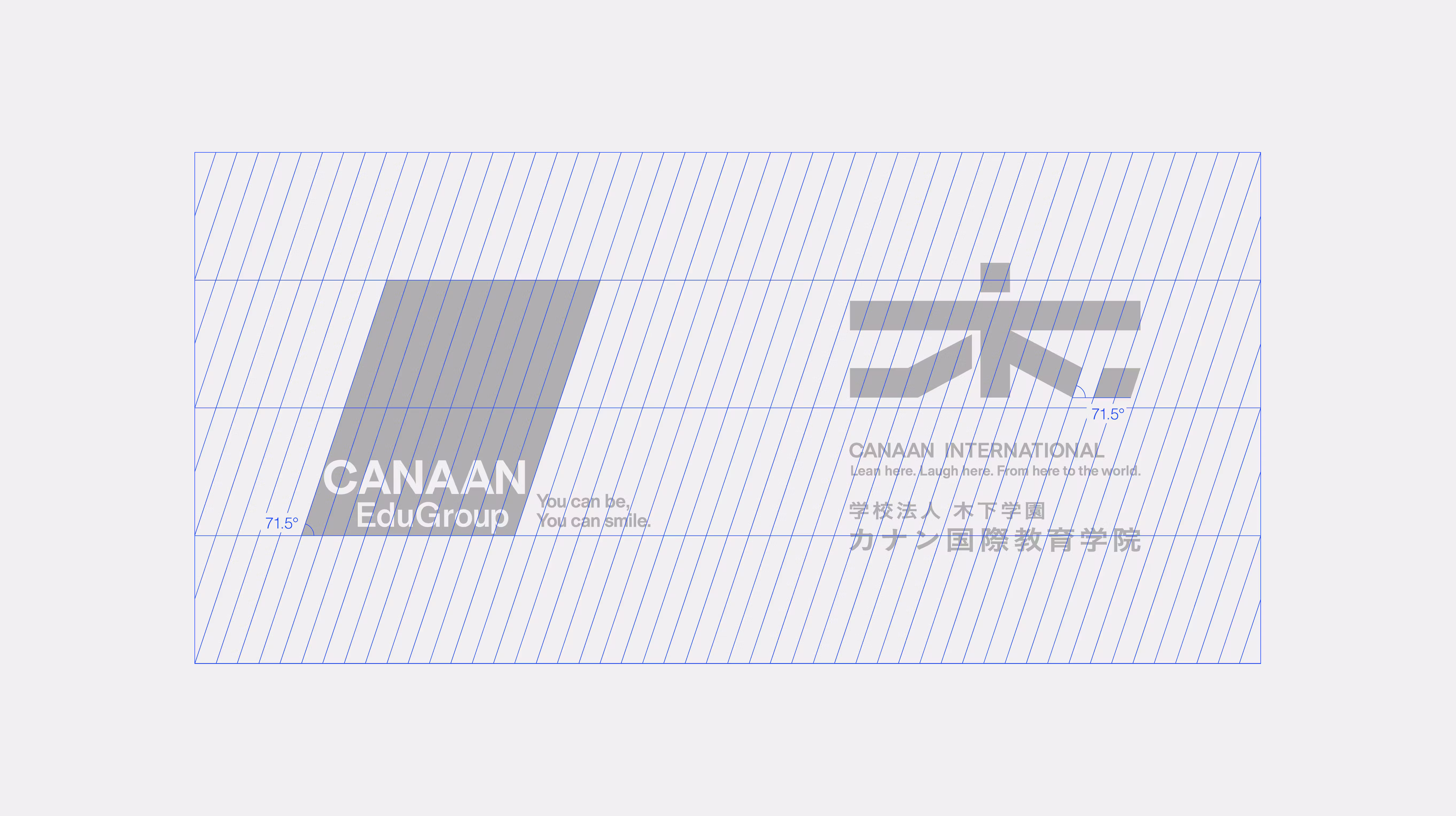
CANAAN Education Group (Kinoshita Gakuen Educational Foundation)
(Description)
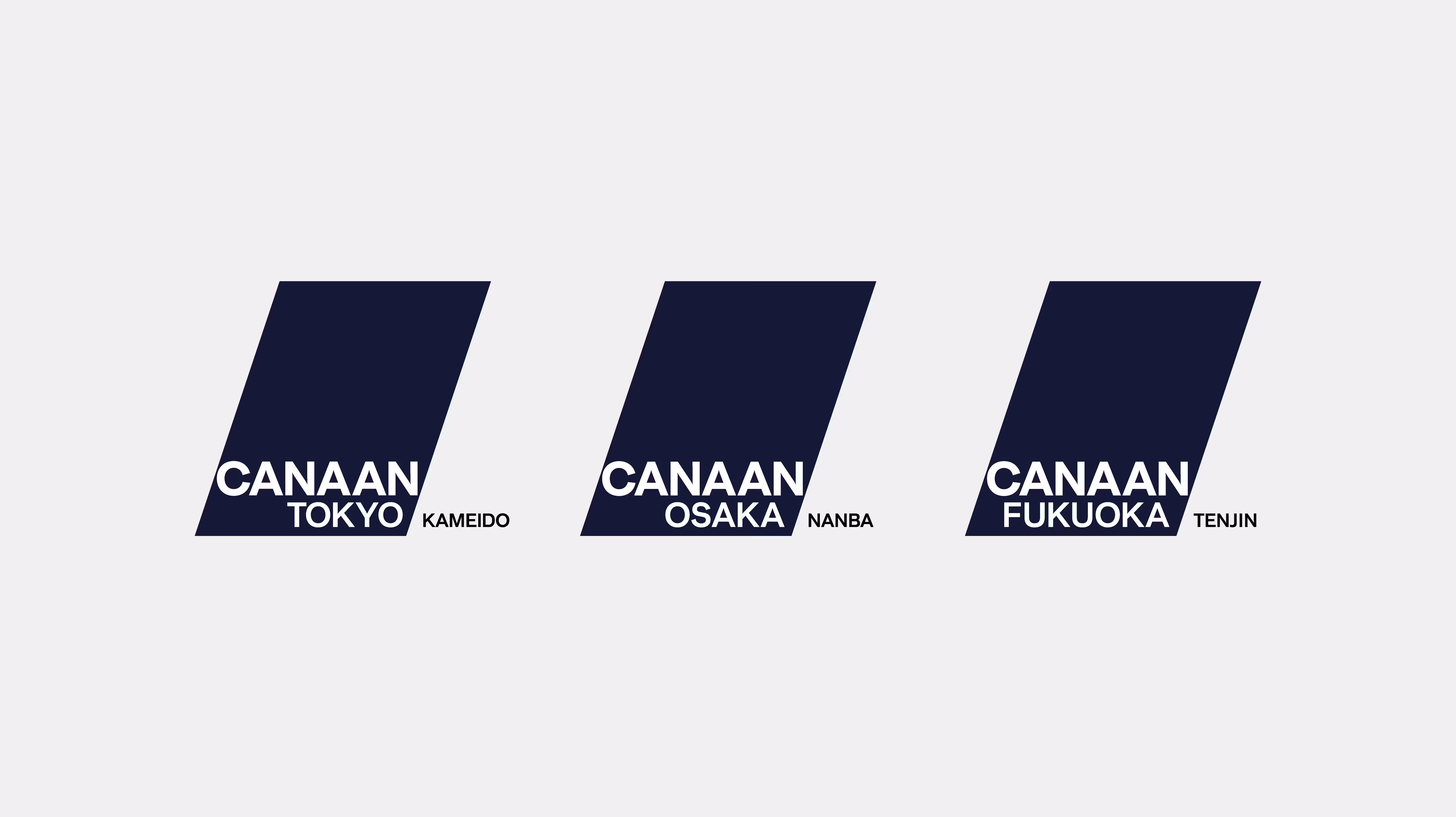
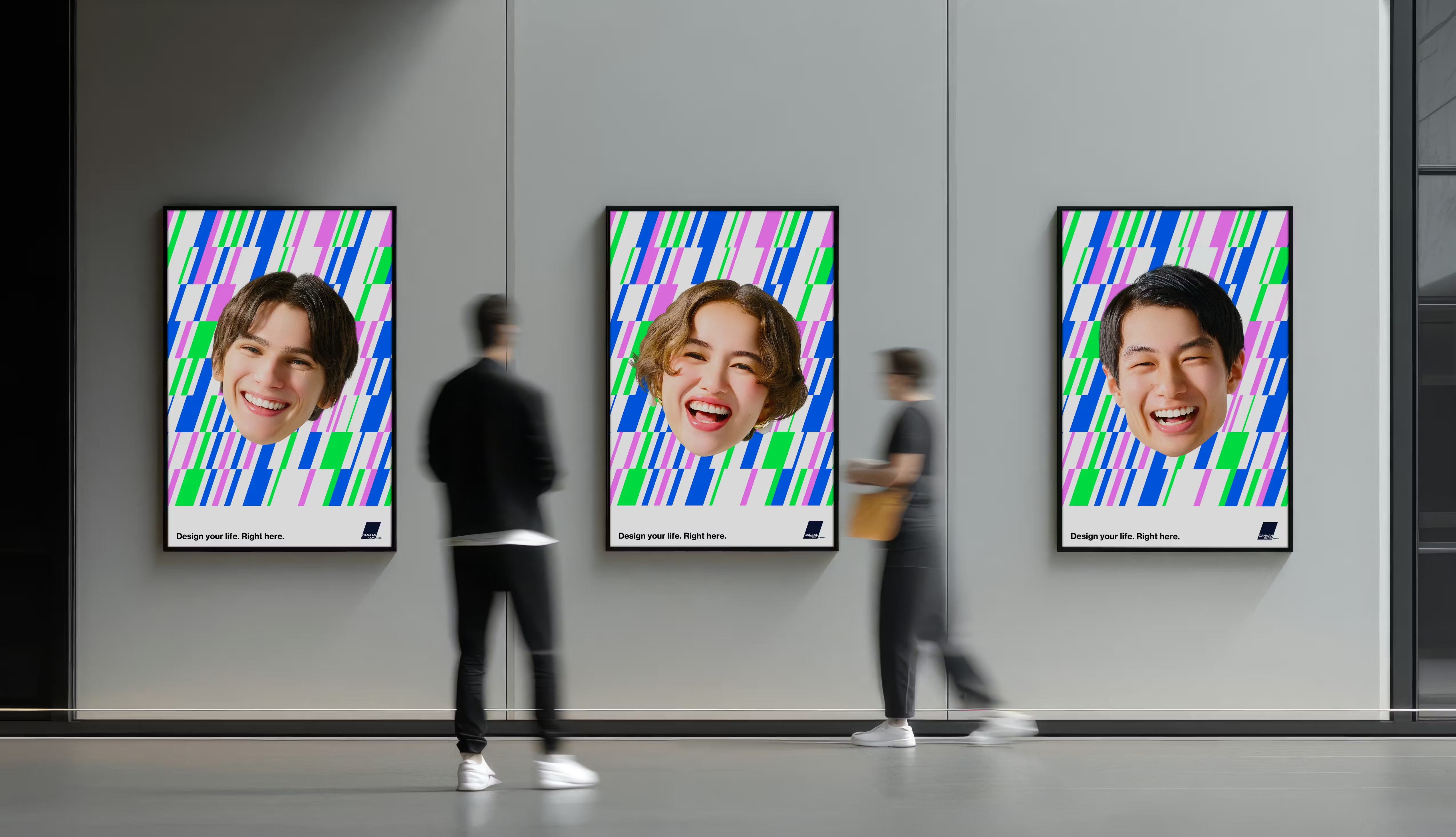
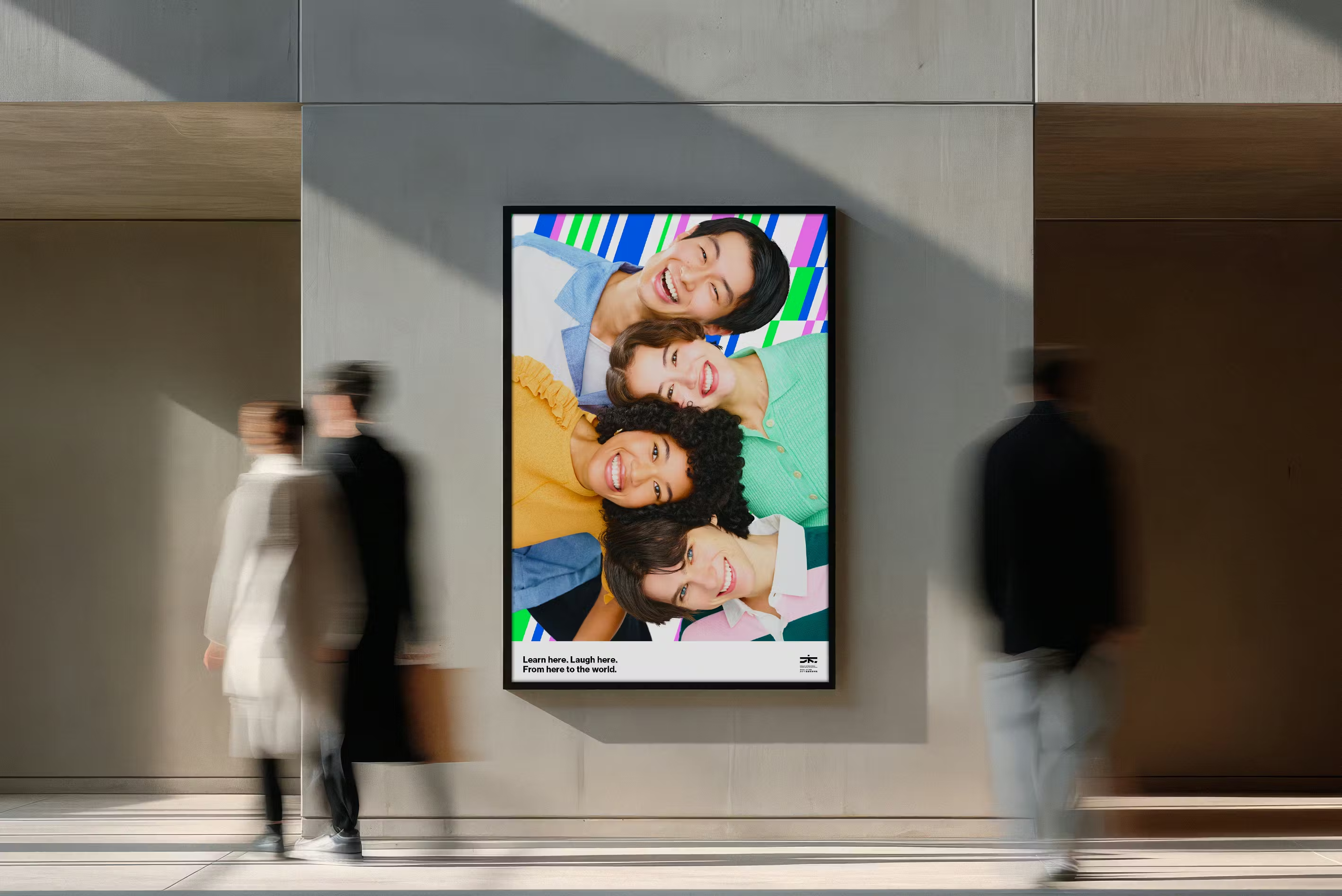
Following the expansion of the Canaan Education Group, which hosts international students from 21 countries, a comprehensive rebranding was implemented. reynato.tokyo was responsible for establishing a Visual Identity (logo, colors, typography, and elements) and Key Visuals that balance unity across the diverse group schools with their individual characters.
(Styling)
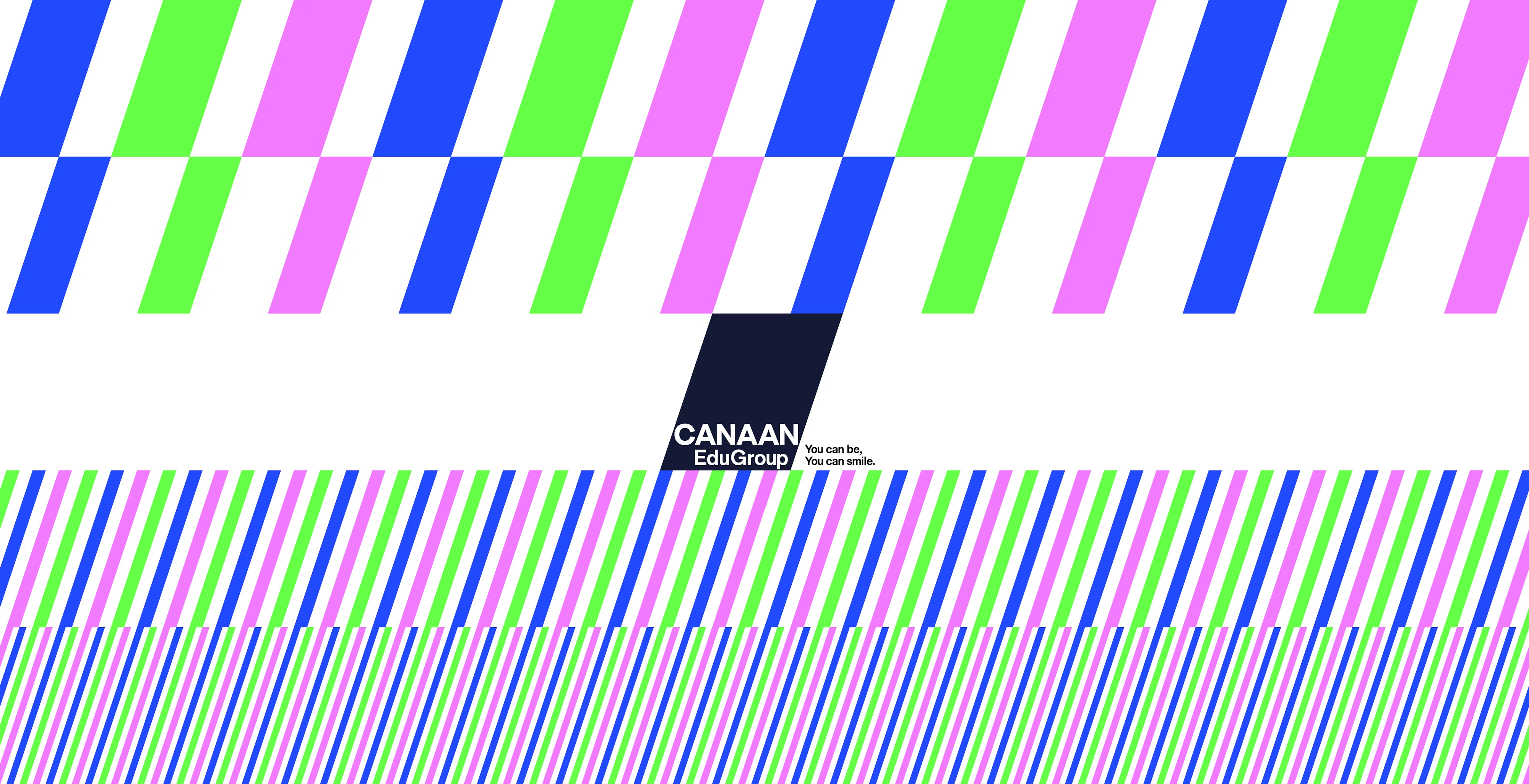
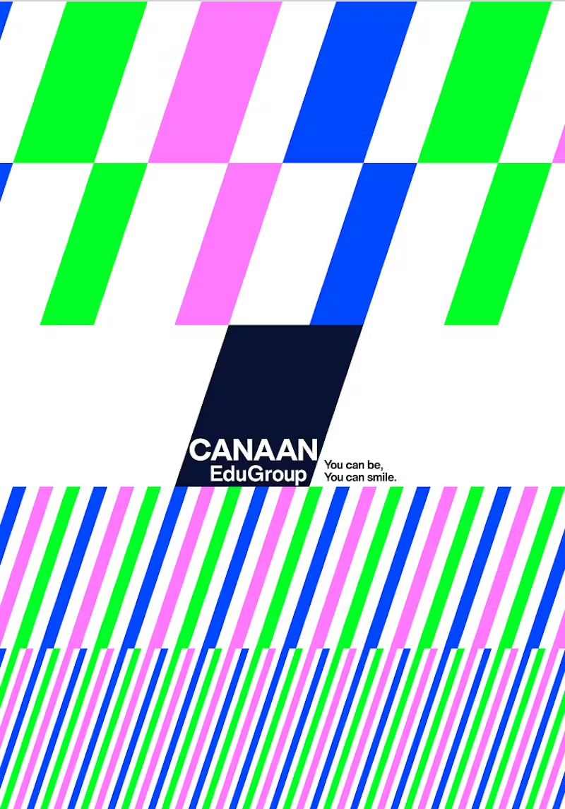
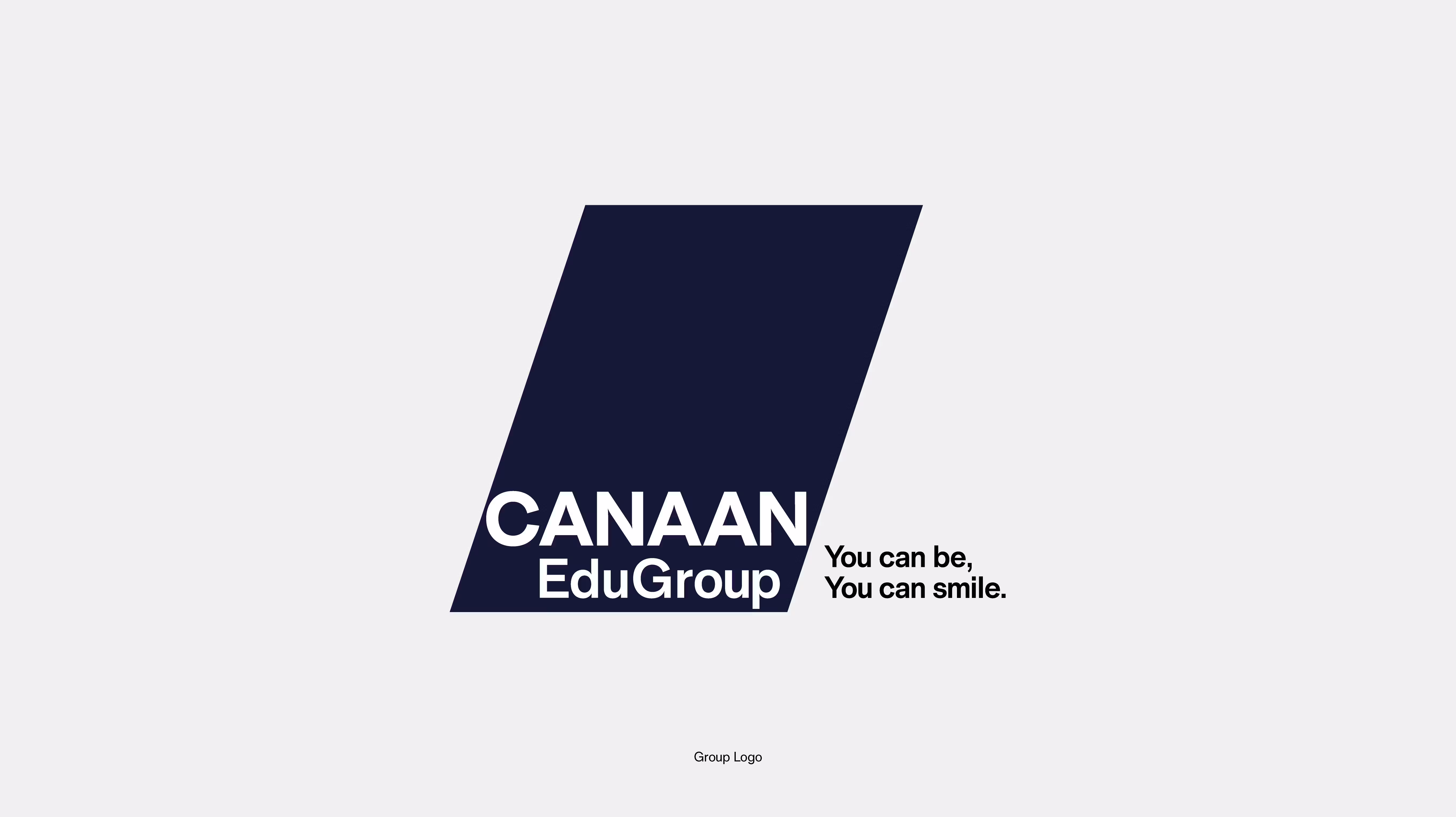
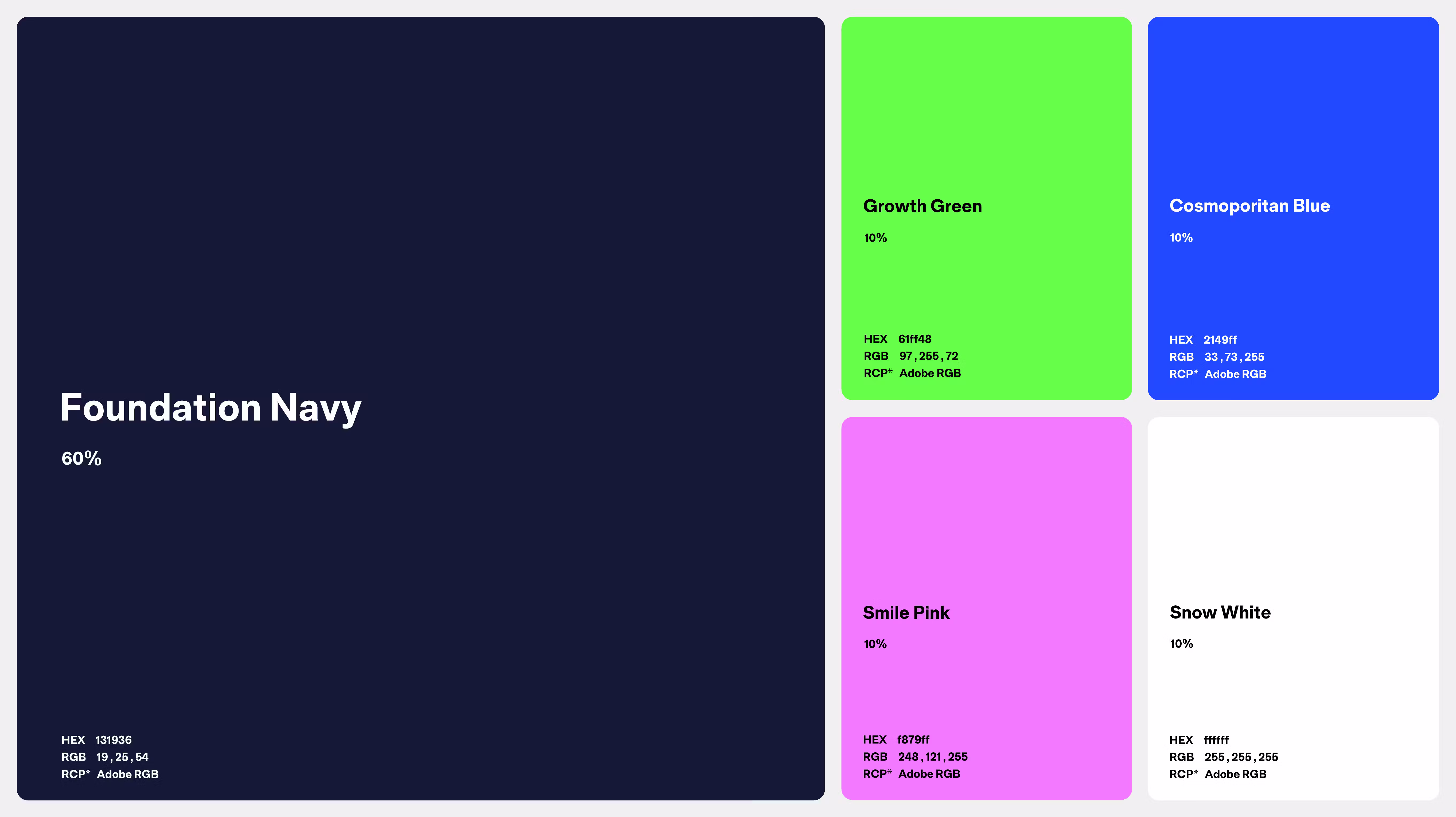
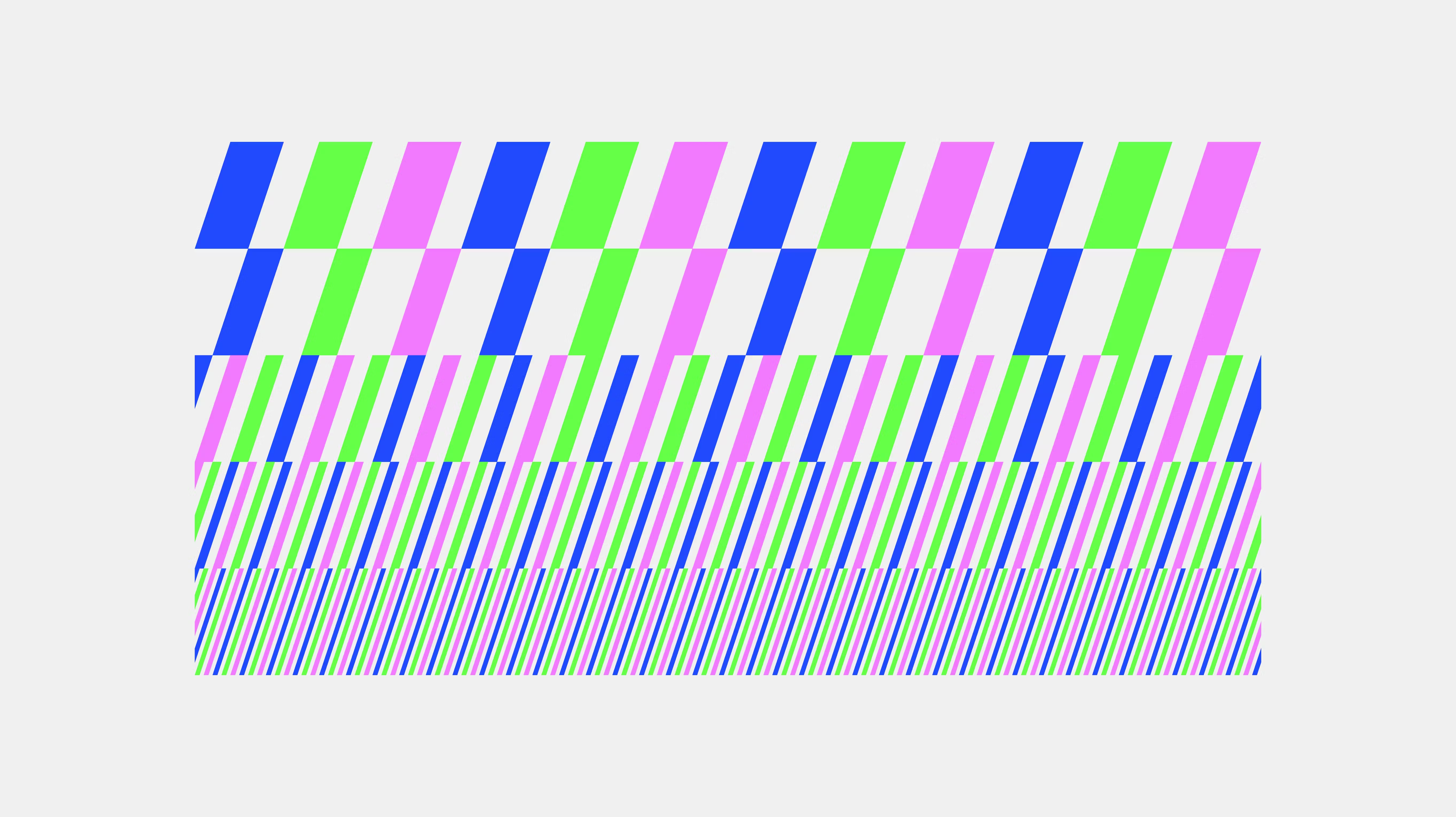
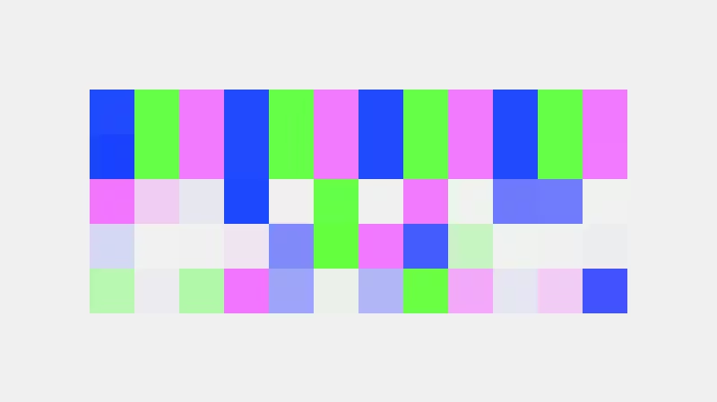
To address the branding challenges of existing creatives, we developed a visual system focused on digital appeal and clear differentiation from competitors. The visual concept is "SPARK YOUR FUTURE." We visualized the moment a student achieves their goal and smiles as a "sparkle," reflecting this in the logo and design elements. The design embodies a commitment to not just language education, but the development of human potential. While "Foundation Navy"—symbolizing history and trust—serves as the base color for the entire group, we used combinations of elements and colors like "Growth Green" and "Smile Pink" to express the unique characteristics of each school, such as the academic-focused Canaan Tokyo Japanese Language School and the culture-oriented Canaan International Education Institute. The key visuals, which symbolically feature "smiles," merge with the tagline to intuitively convey the future one gains by studying at Canaan. We have elevated this into a sustainable visual system that maintains brand consistency while allowing for flexible expansion as the group grows.
(Our roll)
Visual Identity
Art Direction
(Launch)


(Project team)
Producer Riku Sato
Creative Director Kensuke Suzuki
Art Director / Designer (visual Identity) KAITO SHIMAMURA
Designer (key Visual) Ari Motomiya