Barbizon
Production
(Client)
Barbizon Co.,Ltd
(Description)
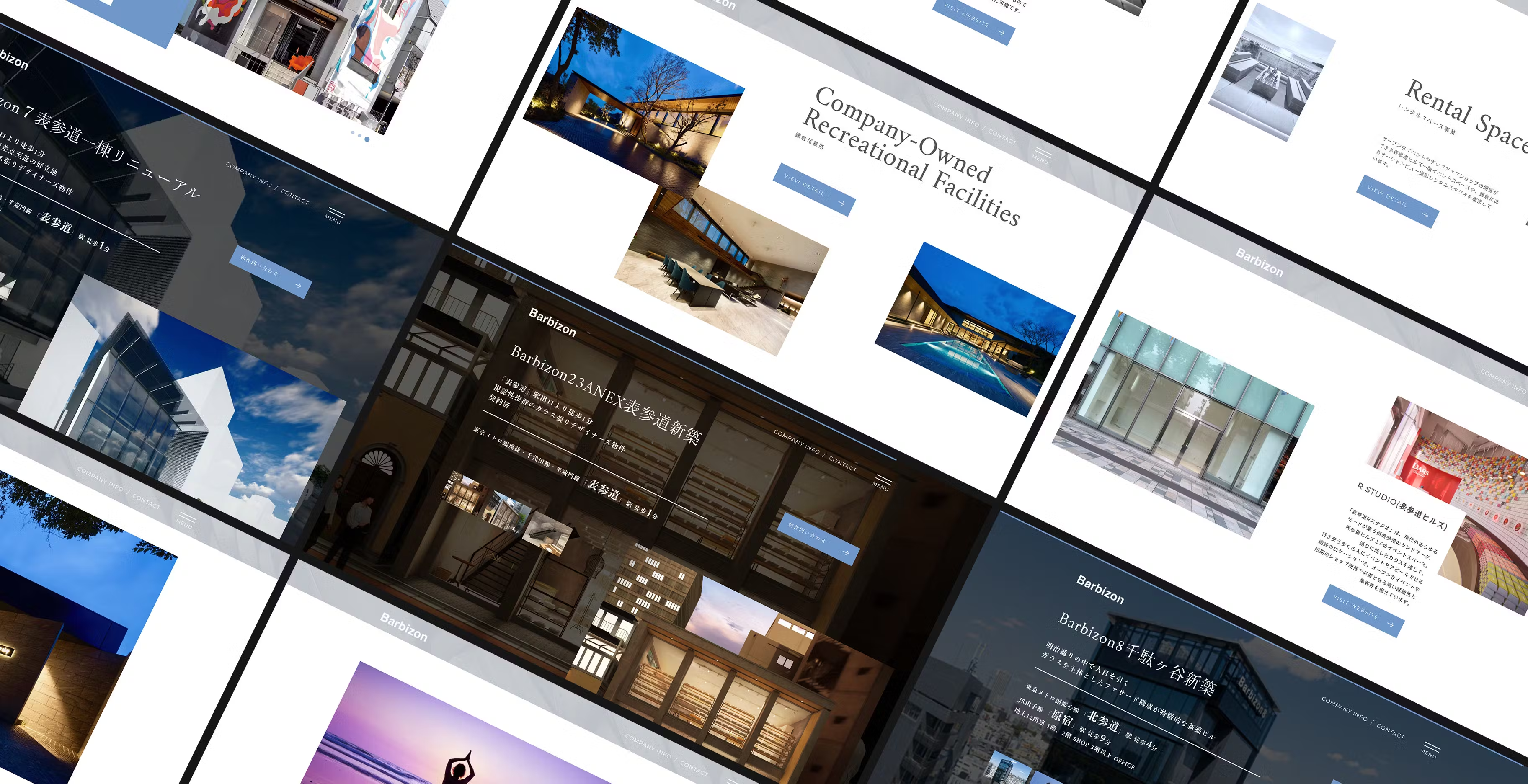
We rebranded Barubizon Co., Ltd., which operates in the building leasing and rental space business. Our main focus was on renewing their corporate website.
(Styling)
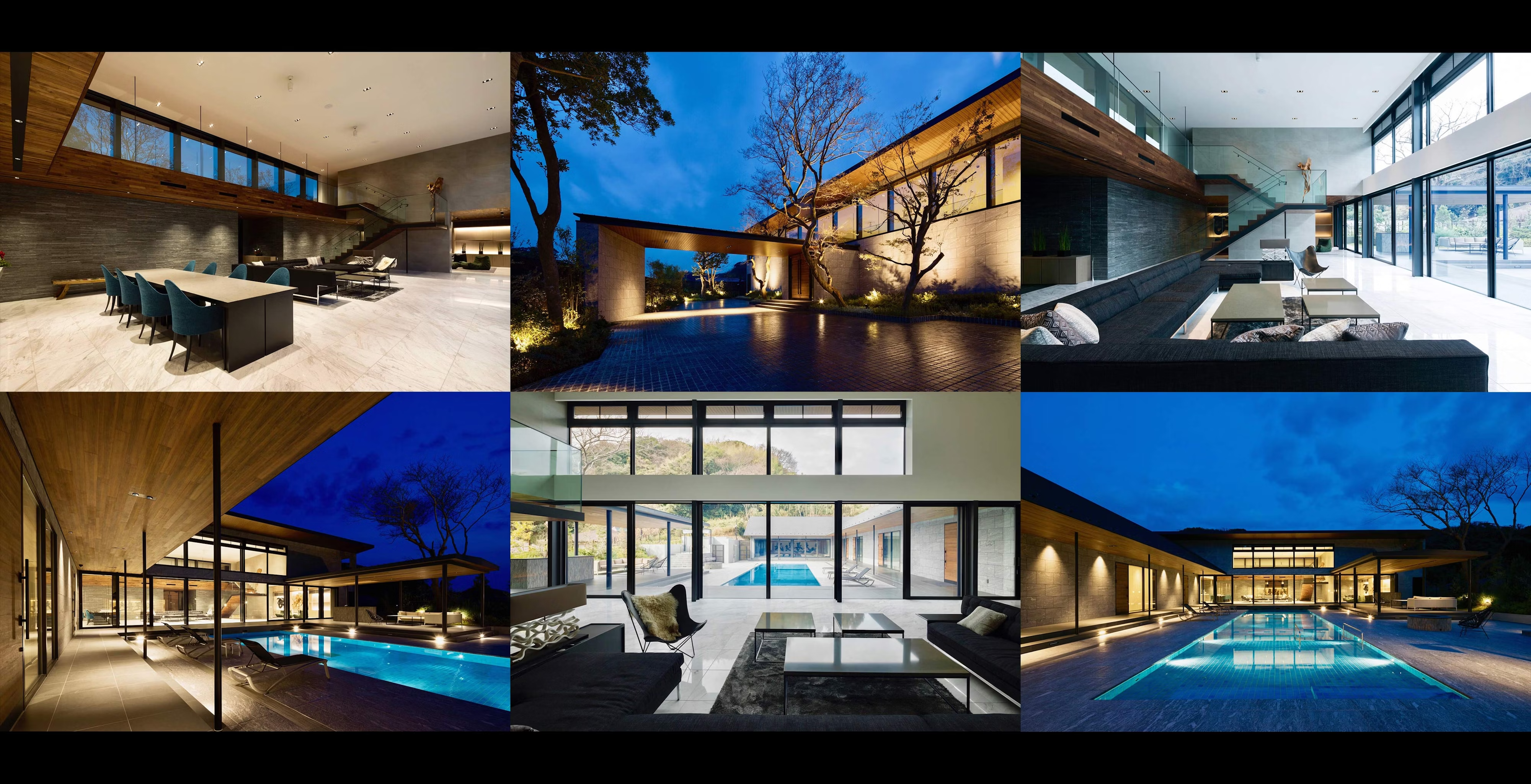
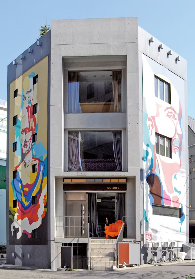
The Barubizon series consists of buildings and apartments, each with a distinctive and memorable exterior. The rebranding project began with a simple client request: "We want a corporate website that is as beautiful as the properties' exteriors." We centered the design around Barubizon’s corporate color, blue, while ensuring ample white space and a sense of openness. The site was designed to showcase the stunning properties the company owns through an abundance of photography. Parallax effects were also incorporated, making the site not only visually appealing but also enjoyable to explore.
(Our roll)
Web Production
(Launch)




(Project team)
Art Director / Designer Kensuke Suzuki
